This exercise is inspired by Chapter 9 in Eric Meyer on CSS. The goal is to be able to produce a two-column layout using valid HTML and CSS. The layout of the page should be
+--------------+
|title         |
|--------------|
|body   | menu |
|body   |      |
|body   |      |
|--------------|
|  copyright   |
+--------------+
None.
This blog file and the Creative Commons license logo.
Load blog.html in your favourite editor. Read through it. Load it in your browser as well, and look at the result. Ugly, isn't it? Let's start by adding a proper html structure.
<html>
<head>
  <meta http-equiv="Content-type" content="text/html; charset=utf-8" />
  <title>RailsToItaly, report of the 1st day</title>
</head>
<body>
  Random thoughts on life and programming
  ...
</body>
</html>
Reload the page. The encoding should now be OK.
Now work on the body. Add headings and paragraphs:
<h1>Random thoughts on life and programming</h1>

<h3>Archives</h3>

<a href="http://some-site.com/">October 2008</a>
...

<h2>RailsToItaly, report of the 1st day</h2>
<h4>October 29th, 2007</h4>

<p>  Yesterday ...
</p>

<p>  Zed ....
</p>

<p><a rel="license" ... >
</p>
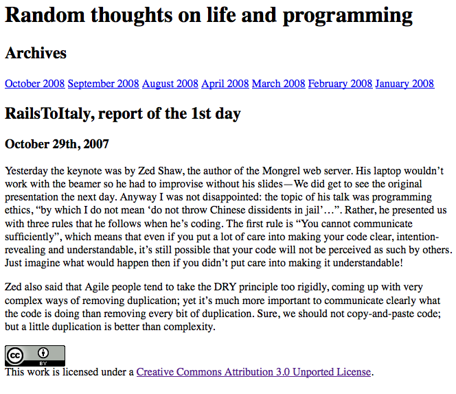
The page should now look like this:
In the head section of the document, add a style element, and type the following:
<style type="text/css">
  html {
    font-size: 10pt;
    font-family: Verdana, Arial, Helvetica, sans-serif;
  }
</style>
Reload the browser. See the font change.
Add style to the headings:
h1 {
  font-size: 200%;
  text-transform: lowercase;
}
h2 {
  font-size: 130%;
}
h3 {
  font-size: 100%;
}
h4 {
  font-size: 80%;
}
Reload the browser. See the headings change. Then add some style to paragraphs:
p {
  line-height: 1.66;
  margin: 0.5em 3em 1em 3em;
}
Reload the browser. See the effect. Finally, let's add some style to the copyright section.
p#copyright {
  font-size: 80%;
  color: gray;
}
We need to add id="copyright" to the copyright paragraph. Reload the browser and see that the copyright is no longer aligned with the other paragraphs. This is because the font-size in the paragraph is now 80% of the default, which is 10pt, and we specified a left-margin of 3ems. To correct this, we must add an appropriate left-margin: 3/0.8 = 3.75. Add to the style
p#copyright {
  font-size: 80%;
  color: gray;
  margin-left: 3.75em;
}
and reload the browser to see the copyright paragraph is now left-aligned with the other paragraphs. 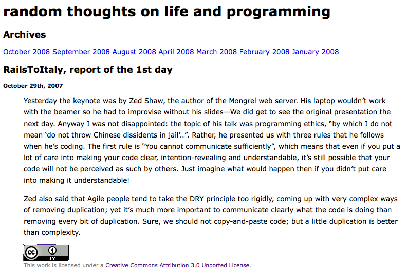
Let's wrap the blog entry and the archive section in a two-cell table. The body of the document should look like this:
<h1>Random thoughts on life and programming</h1>

<table cellspacing="0" cellpadding="0">
  <tr>
    <td>
      <h2>RailsToItaly, report of the 1st day</h2>

      <h4>October 29th, 2007</h4>
      <p>  Yesterday ...
      </p>
      <p>  Zed also said ...
      </p>
    </td>
    <td>
      <h3>Archives</h3>

      <a href="http://some-site.com/">October 2008</a>
      ....
    </td>
  </tr>
</table>

<p id="copyright">
...
</p>
This markup looks ugly, since we're adding non-semantic markup to the html document. But at least it's simple and it works. Reload the browser. Drats! The archives section is vertically aligned with the middle of the other column. Correct this by adding the attribute valign="top" to both cells:
<td valign="top">
Reload and see that the vertical alignment is right. The copyright section, though, is still off. We'd rather stop trying to align it to the other paragraphs, and center it in the page.
p#copyright {
  font-size: 80%;
  color: gray;
  text-align: center;
}
Reload and see the effect. Try changing the size of the browser window and see how the two columns change size accordingly.
We want the whole document to look a bit more like paper, so we add background and foreground colors:
html {
  font-size: 10pt;
  font-family: Verdana, Arial, Helvetica, sans-serif;
  background: rgb(95%,95%,80%);
  color: black;
}
The foreground color should already be black, but it's a good habit to always specify both colors. Reload the browser.
A standard trick to turn links into "buttons" is to make them block-display elements.
#archives a {
  display: block;
  padding: 0.1em 0.1em;
  margin: 0;
}
#archives a:hover {
  background: rgb(85%,85%,70%);
}
We also need to add an id="archives" attribute to the table cell that contains the archives. Reload the browser. Move the mouse over the links. The column looks too narrow. Let's give it more room:
#archives {
  width: 20%;
}
Reload the browser, change the windows size making it more narrow or more wide, and see the result.
Optionally, let's give the archives a bit more style with
#archives a {
  ...
  border-left: 1px solid gray;
}

#archives h3 {
  color: gray;
  border-bottom: 1px solid gray;
  margin: 0;
  padding: 0;
}
That's ok for now:  .
.
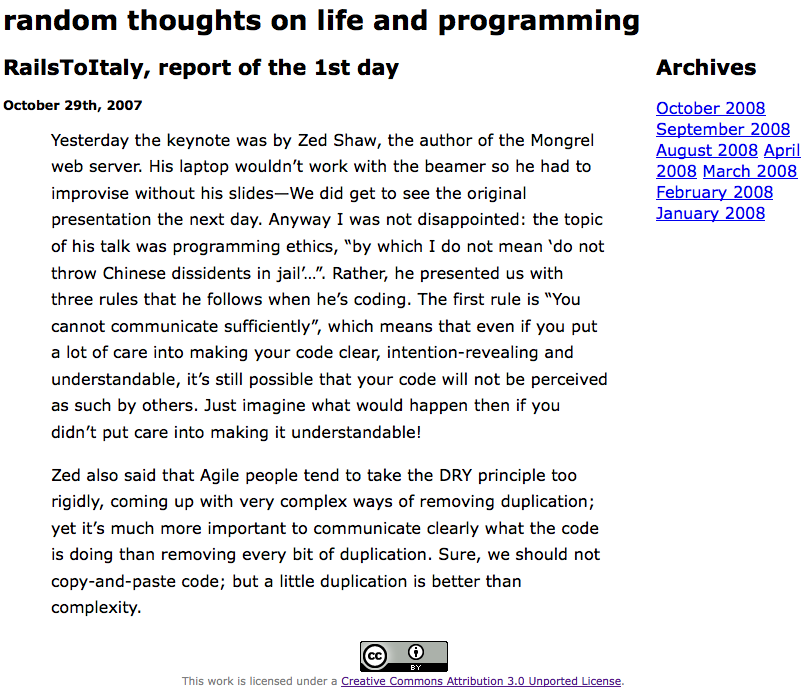
The non-semantic markup is highly undesirable. Let's change it to something more palatable. Begin by removing the table, and wrapping the archives section and the entry section in their own divs.
<h1>Random thoughts on life and programming</h1>

<div id="entry">
  <h2>RailsToItaly, report of the 1st day</h2>

  <h4>October 29th, 2007</h4>

  <p>  Yesterday ...
  </p>
  <p>  Zed also said ...
  </p>
</div>

<div id="archives">
  <h3>Archives</h3>
  ...
</div>

<p id="copyright">
...
</p>
Reload the browser. Now the archives section is following the entry. That will be good for screen readers, because the content will be read first and navigation second. But we want back the two-columns layout. Add the following styles:
div#entry {
  margin: 0 25% 1em 7%;
  padding: 0;
}
Reload the browser. This leaves enough room on the right of the entry.
#archives {
  width: 20%;
  position: absolute;
  top: 0; right: 0;
  width: 20%;
}
Reload the browser. Now the menu is on the top-right corner. We must move it down, but how much? We don't know how much margin the h1 is being given; every browser will use different values. To force a known value, we add:
h1 {
  ...
  padding: 0;
  margin: 0.66em 1em 0.33em 1em;
}
Now we know that the h1 is taking 1em (for the text) plus 0.99em for the margin, which is roughly 2ems. Now we know that the h1 is 200% of the normal text. So the h1 is taking 4ems in terms of the normal font size. Therefore, we change
#archives {
  ...
  top: 4em; right: 0;
  font-size: 10pt;
  ...
}
We repeat the font-size so that no browser should be confused as to which font-size our ems refer to. Reload the browser: the two entries are still not top aligned. Some more work is needed: set the line-height of the headings to 1, a known value:
h1, h2, h3, h4 {
  line-height: 1;
}
Remove top padding and margin from h2 and h3
h2, h3 {
  margin-top: 0;
  padding-top: 0;
}
Reload the browser. Now the two sections are well aligned. Now move the copyright section a bit down so that it does not get so much in the eyes
p#copyright {
  margin-top: 4em;
  ...
}
And we're finished! 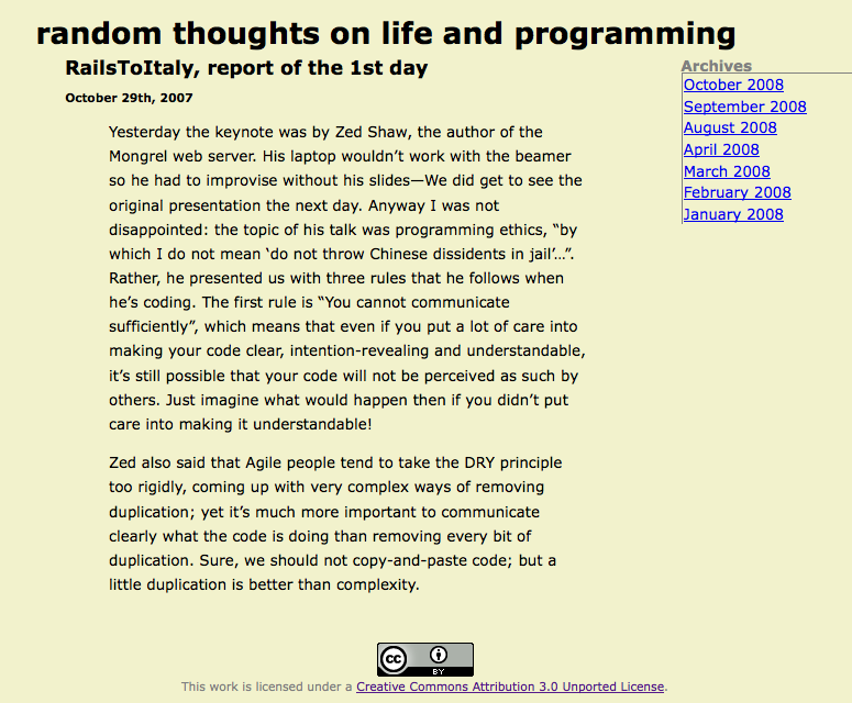 The final style is:
html {
  font-size: 10pt;
  font-family: Verdana, Arial, Helvetica, sans-serif;
  background: rgb(95%,95%,80%);
  color: black;
}
h1 {
  font-size: 200%;
  text-transform: lowercase;
  padding: 0;
  margin: 0.66em 1em 0.33em 1em;
}
h2 {
  font-size: 130%;
}
h3 {
  font-size: 100%;
}
h4 {
  font-size: 80%;
}
h1, h2, h3, h4 {
  line-height: 1;
}
h2, h3 {
  margin-top: 0;
  padding-top: 0;
}
p {
  line-height: 1.66;
  margin: 0.5em 3em 1em 3em;
}
p#copyright {
  margin-top: 4em;
  font-size: 80%;
  color: gray;
  background: rgb(95%,95%,80%);
  text-align: center;
}
div#entry {
  margin: 0 25% 1em 7%;
}
#archives {
  width: 20%;
  position: absolute;
  top: 4em; right: 0;
  font-size: 10pt;
  width: 20%;
}
#archives a {
  display: block;
  padding: 0.1em 0.1em;
  margin: 0;
  border-left: 1px solid gray;
}
#archives a:hover {
  background: rgb(85%,85%,70%);
}
#archives h3 {
  color: gray;
  border-bottom: 1px solid gray;
  margin: 0;
  padding: 0;
}